Translating the Supplied Visual System
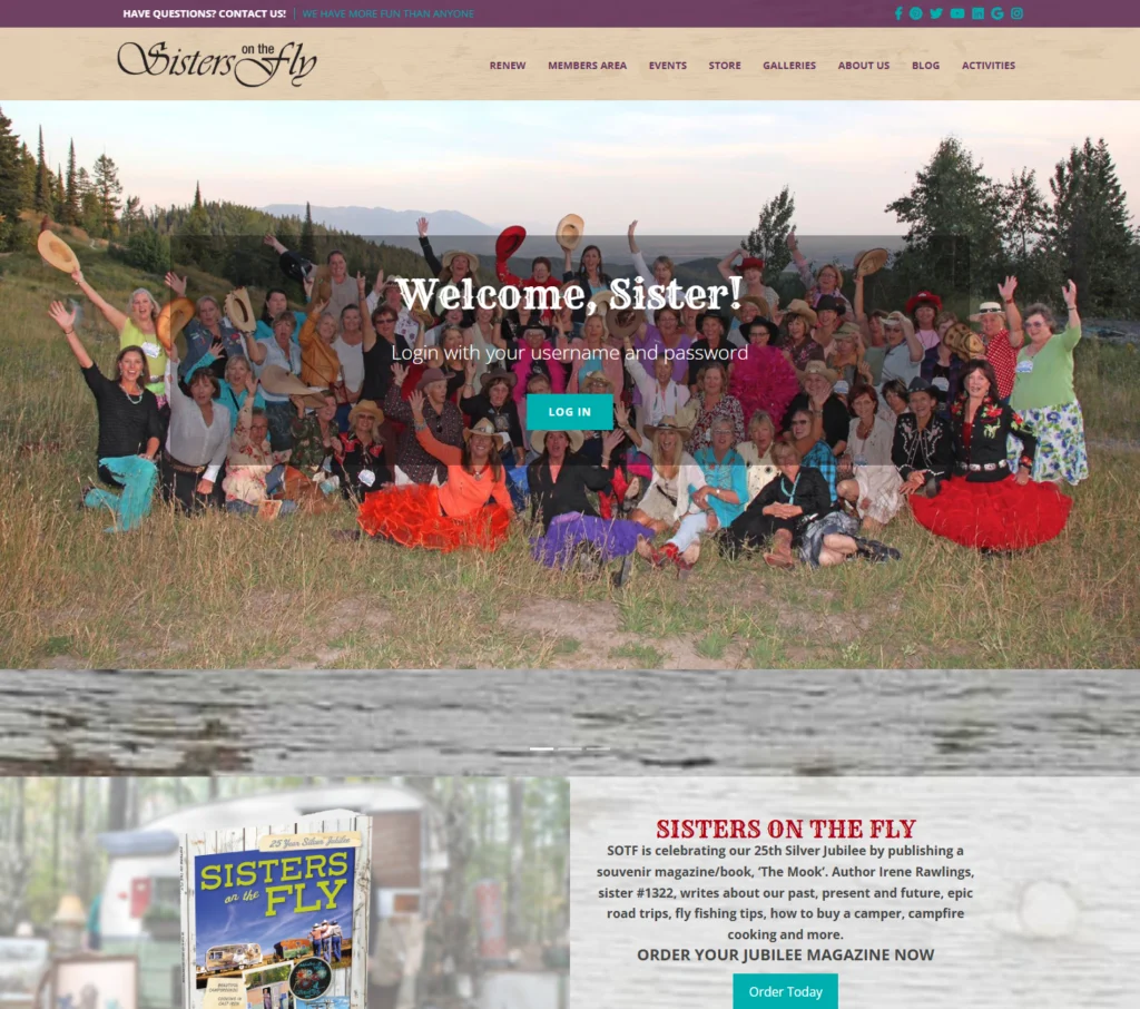
The supplied direction used weathered wood textures, warm natural surfaces, turquoise, deep plum, red accents, large decorative display typography, photography, and Western-inspired visual details. The implementation carried those elements throughout the production site instead of flattening them into a generic template.
Building the Complete Homepage
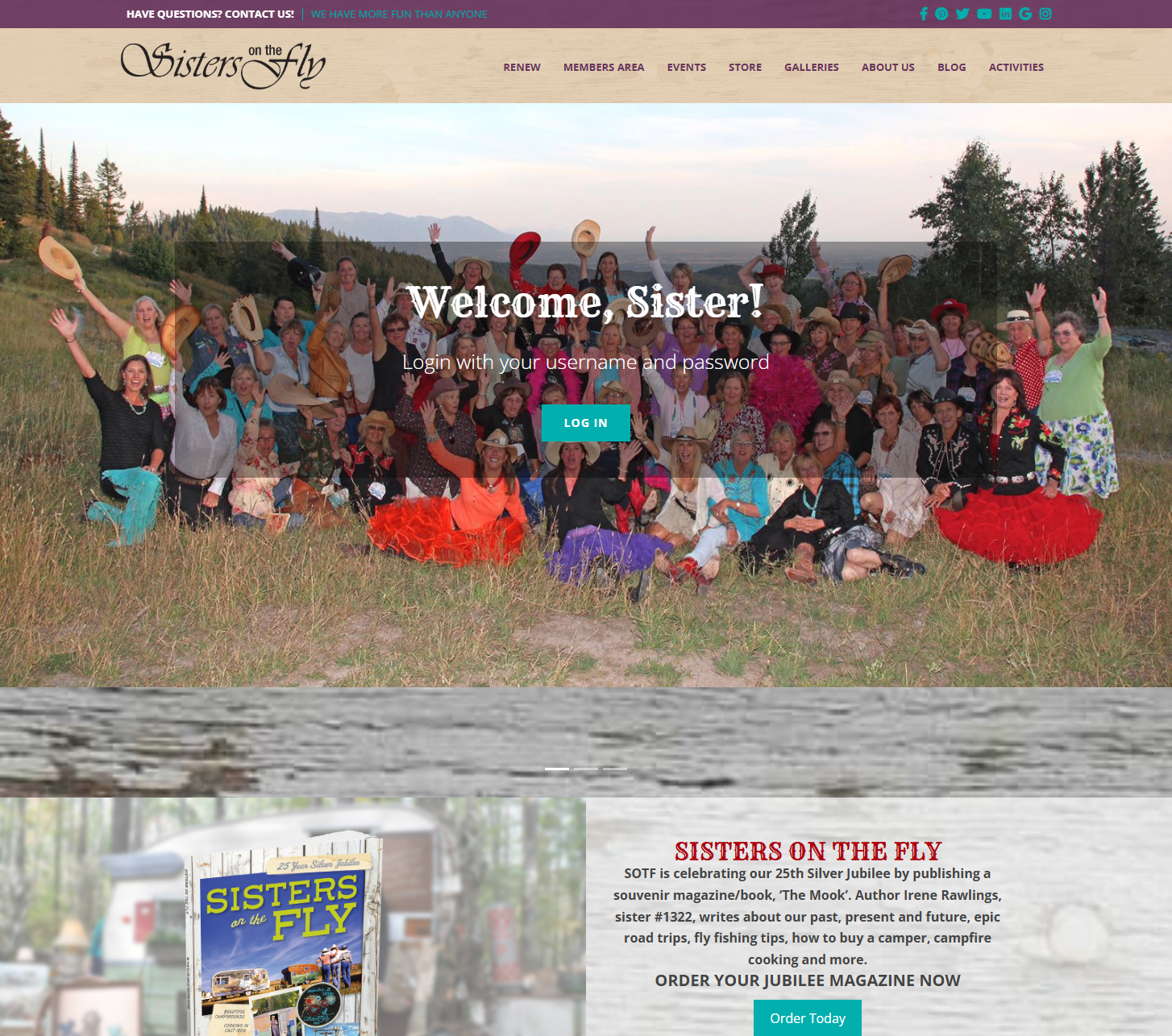
The homepage combined global navigation, a large member hero, login access, magazine promotion, membership guidelines, newsletter registration, trailer-focused content, product merchandising, news content, community messaging, calls to action, and an informational footer while preserving one coherent visual system.
Responsive Implementation
The mobile build required substantial reflow rather than a scaled-down desktop page. Navigation collapsed, multi-column sections became stacked flows, images were cropped and repositioned, product presentation was simplified, and newsletter, news, CTA, and footer content reorganized into a readable single-column experience.
Public Website Architecture
The implemented navigation supported renewals, members area access, events, store content, galleries, about pages, blog content, and activities, making the site the front door to a larger community platform rather than a single promotional landing page.
Member-Facing Interface Implementation
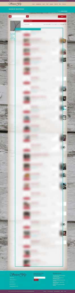
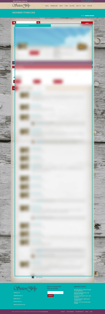
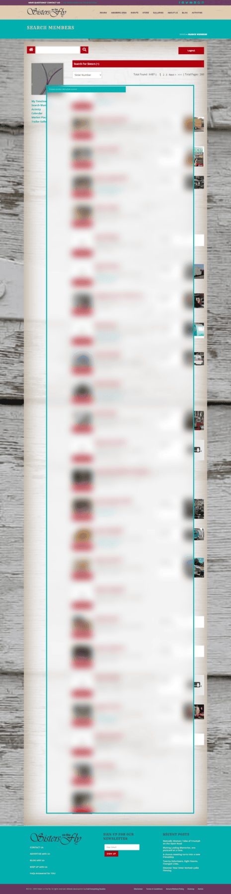
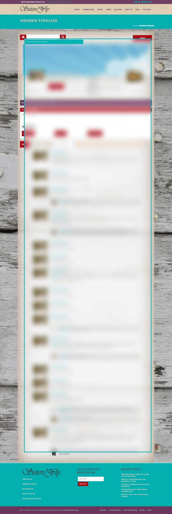
The supplied visual language was extended into authenticated screens including member search and member timeline interfaces. The redacted screenshots show how the public site’s colors, typography, textures, header, controls, and footer were carried into denser application-style pages.
Design Credit
Original visual design: Aeon Marketing. WordPress implementation and responsive development: Michael Munoz. This case study focuses on Michael’s design-to-production work, not authorship of the original art direction.